
Image by u2tryololo via Flickr
The natural world is a great source of design inspiration. Colors found in
nature can harmonize or contrast, but our familiarity with the natural world means the resulting
color combinations will still feel harmonious and organic. These color combinations can be great to
use when you want to evoke associations with health and vitality, outdoors activities, or
environmental consciousness.
Image by u2tryololo via Flickr
Fresh greenery and colorful blossoms make springtime a welcome sight after
a long winter. This color combination features
bright shades of green and coral that will make your design pop. These types of colors are perfect
for a spring or summer event poster or an advertisement that wants to communicate a fresh, youthful
feeling.

Image by Vincent D’Amico
Red and blue are common colors for branding, and for good reason. Red says
“confident and powerful,” while blue says “calming and trustworthy.” This color combination offers a
little bit of both, with slightly muted shades that aren’t overpowering. The brick red adds a burst
of extra color to the more conservative blues while still keeping a professional look.

Image by Wolfgang Staudt
Desert landscapes are full of complex shades of brown, purple, and red,
and so is this color combination. For an unexpected color combination that is toned down, try this
combination of plum and reddish oranges.

Image by Alexander Shchukin
Iceland’s natural beauty is legendary, and this color combination finds
inspiration in its dramatic contrasts. The warm, grayish undertones of the top two colors contrast
nicely with the cooler greens. The range of lighter and darker shades makes it easy to combine any
two or three of the colors and have them still complement each other.

Image by Sunova Surfboards
Monochromatic color combinations (made up of the various tints, tones, or
shades of one color) are extremely versatile. While this combination may not qualify as
monochromatic according to the technical definition, it creates a similar visual effect. With a
color as versatile as blue, this combination could be used just about anywhere.

Image by PapaPiper via Flickr
If you have a brand or need a design that emphasizes natural or
green-friendly qualities, greens and browns are a logical choice. This color combination brightens
things up with a splash of lime green for emphasis.

Another winner for any brand looking to emphasize its eco-credentials.
This moody color combination of watery shaded greens has a subtle sophistication.

Image by Clint Losee
Bright colors have undeniable eye-catching power. This primary color
combination is ever-so-slightly muted, giving the palette a muted sunset effect.

Crisp turquoise hues set off bright yellow and bubblegum pink for a color
combination almost reminiscent of Easter candy. You can also leave the pink out and opt for the aqua
shades and yellow for a bright, clean combination.

Image by Shandi-lee Cox
The bluish shades at the top and bottom of this selection have gray
undertones. This muting makes them almost neutral—a great foundation for playing with more daring
tones like the lime green.

The almost neon shades of blue and green balance out the more conservative
colors and add a bright freshness that gives the color combination some kick. This kind of scheme
might work well for a fitness brand or any design that needs to balance a businesslike feel with an
energetic vibe.

This landscape of sea and stone features warm and cool colors in bright
and subdued shades. The beachy, mellow color combination brings to mind relaxing island vacations.
This is one example of how we can associate color with certain places, moods, or
emotions.

These earthy colors are rustic, evoking woodsy autumnal feelings. This
color combination would be perfect for anyone looking to add a rugged or down-to-earth touch to
their brand.

Contrast warm grays with cool, glacial blues for a dynamic color
combination. Blue and gray can be an understated combination, but the icy brightness of the blue
here brings more visual energy. Try these lighter, brighter hues rather than opting for navy and
dark gray if you want to add some vibrancy to your designs.

Much like the image, this color combination brings to mind the first
moments of spring and the newly emerging flowers, buds, and berries.

This color combination is a perfect example of the power of contrast. The
strong, bright hues of the yellow and orange are balanced by the indigo and navy tones, creating an
overall effect that is graphic and powerful.

The muted shades in this color combination have a vintage vibe. Light aqua
and gold were popular in interior and graphic design in the 1950s and ’60s, but that doesn’t mean
this combination looks dated. These colors have seen a resurgence in popularity in recent years
along with mid-century modern design style.

Nothing says liveliness more than these varied citrus hues. Orange,
yellow, and lime green are the perfect choices if you want a color combination that suggests
freshness and vitality.

The colors that are seen across the sky as the sun sets and moves toward
twilight come in a wide range of peaches and blues. This color combination creates a soft and
sophisticated palette that will make any design unique.

A color combination so tropical you can almost feel the warm breeze on
your skin—these warm colors will add a youthful energy and vitality to your next design.

Think of changing leaves and the various shades of brown, red, orange, and
green of the foliage. Use this color combination to create a design that is appealing and
cozy.

This color combination balances out bright red with soft brown, yellow,
and green. This combination can be used to create designs that are bright and fun while the fresh,
natural tones keep it soothing.

This color combination has an outdoor feel to it, like a summer baseball
game or a field of sunflowers. This combination uses bright primary and secondary colors, with a
slightly muted orange that lets the blue-yellow end of the spectrum be visually dominant.

Pairing black and white with bright, crisp shades of green makes for a
modern color combination that is sophisticated without being too serious. Instead of pairing red or
blue with your black and white, freshen things up with some green.

This is a classic color combination. Neutral navy and ivory play off the
red and peacock blue in this combination.
Food evokes feelings of hunger and mouth-watering cravings. Edible goods
are an obvious inspiration for restaurants and food producers. They can also be used strategically
to stoke the appetite of your viewers for whatever it is you’re designing.

Neutral color combinations like these shades of gray and tan are versatile
and can be paired with almost anything. This color combination can have different effects based on
how it’s used. It can give an upscale and sophisticated effect, like the branding for a luxury
hotel, if it favors the grays. Otherwise, it can create a calming and comfortable feeling, like a
neighborhood coffee shop, if you use more of the brown and taupe.

Bold but not overly bright, this color combination is eye-catching and
cheery while remaining sophisticated.

Orange is often associated with energy—and what's more energetic than
these two complementary orange tones? The off-white and pear green colors balance the color
combination, creating a fresh feel.

This color combination is pure nostalgia. It evokes memories of warm
summer afternoons, hanging out in the backyard, and just enjoying the day.

An effective color combination doesn't need to use extremely different
colors, as this combination demonstrates. The different shades of blue are perfectly balanced and
conjure the trustworthiness blue promotes.

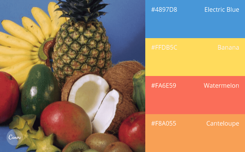
This cheerful color combination of reds, oranges, and yellows will perk up
any design. It looks juicy, like a melting popsicle or a summer spritz. Yellow and orange have been
shown to increase the heart rate and make viewers hungry, so this color combination is great for advertising food.

Calming, spa-like greens and blue—great by themselves—look a little more
lively with a splash of raspberry as an accent color. Add a brighter or bolder accent color to a
more restrained selection to liven up a color combination and give it a little extra
interest.
This happy blend of colors doesn’t take itself too seriously. This color
combination is perfect for summer advertisements or children’s designs. A combination like this one
will make it clear where the fun is at.

Shades that have a full range of light to dark make it easier to apply a
color combination to a design. There’s enough contrast that you can choose a background
color, a text color, and an accent color or two just from these four.

Applications for a pastel color combination can be a little more limited.
They will be common in designs for spring, infants, and sweet shops. Pastel colors generally come
across as pretty and delicate, so you’ll want to make sure your design calls for a similar mood if
you want to use a color combination like this one.

A bright color combination that has been slightly shaded with the
inclusion of black or gray into each color base. It will be easy to make elements of your design
stand out with this color combination without creating too many contrasts in your design.

Citrus shades of orange are juicy and appetizing. This color combination
includes an off-white for contrast and shades on both the yellow and red sides of orange, so your
designs will be distinctive and easy to read.

Red and green are one of three pairs of complementary colors on the
traditional color wheel. These colors combine to
make a striking, high-contrast impression that can be a little jarring if you don’t use them
carefully. They can also easily become Christmasy when used at full saturation. These reds and
greens have been balanced and toned down for a fresher twist on a complementary color
combination.

With a neutral white and soft brown paired with brighter warm colors, this
color combination is eye-catching. If you let the neutral hues dominate your design, the red pepper
and onion will make perfect accent colors.

A black background, in this case slightly softened, makes neon brights
pop. Designs using this color combination will draw attention and stand out.

Full saturation red, orange, and yellow are offset by a softer warm
purple. The purple grounds the rest of the color combination and brings sophistication to an
otherwise popping, bright design. It’s also perfect for adding text or emphasis.

Warm grays with a pop of golden yellow is a color combination you’ll
sometimes see in interior design and home décor. It’s primarily neutral, and the warmth of the grays
feels calming and inviting. A pop of yellow adds some cheerfulness and energy for an overall
combination that’s refined without feeling stuffy.

This monochromatic green color combination adds contrast with a bright,
clean white. The pastel light green also contrasts well with the darker emerald. With this
combination, you can give your designs a dynamic effect while the monochrome base keeps things
harmonious.

Reminiscent of winter berries and bare branches against a snowy sky, this
combination of colors would make a great alternative to your traditional Christmas or holiday
palettes. The rich reds paired with violet-tinged grays feel festive but stay
sophisticated.

Appetizing and retro, each of these colors uses a touch of yellow to make
the combination harmonize.

Who says brown has to be boring? Add some red and violet undertones, and
you have a full, rich color combination that—like these chocolate cupcakes—feels a little
decadent.

Yellow draws attention, and this green-tinted yellow stands out
beautifully in a design with the more muted green, brown, and gold shades.

You can mute red and combine it with softer neutrals to create a dynamic
effect that isn’t too jarring.
The salmon and lapis in this color combination contrast brightly against
each other. Soft purple-brown neutrals make a perfect backdrop for any design. This combination is
great for giving a sophisticated pop of brightness.

Bright primary red can be aggressive, so this combination mutes it and
adds some warm neutrals to balance it out.
Color can communicate place and environment. Taking inspiration from
colors around the world allows you to communicate emotions to your audience by association. You can
use the feeling of a relaxing seaside vacation or a dynamic modern city to communicate through
design.

Sun-softened plaster, sea, and sky—this color combination is relaxing and
aspirational, great for designs that want to evoke a desire for time away and days off.

White, black (or, in this case, very dark navy), red, and yellow are a
very common combination. But the saturation here makes this combo unexpected and exciting. If you’re
looking for a bold color combination that makes a strong, eye-catching statement in your design,
this color scheme is easy to apply.

Another more monochromatic design, these earthy tones are warm and
sophisticated.

Bone and coal are softer than a true black and white. The tinted shades of
yellow and blue make for excellent accents for a design that needs to make information
obvious.

These blackened greens create a gradient, like fog coming down off a
tree-covered mountain. The green gives your design a natural softness, while the black tint evokes
strength and boldness.

Many cliff-hugging villages along the Mediterranean coast are often
painted in warm pastels. You can replicate that sunny, carefree look with this selection of shades
and bring a little of the Italian dolce vita to your design, creating a warm and welcoming
effect.

Mustard yellow stands out brightly against deep cool tones. Use this color
combination when you want to draw the viewer’s attention to a particular element or
feature.

This monochrome color combination of blue-tinged greens forgoes a black or
white at either end of the spectrum. The individual elements of a design using this combination may
not stand out, but the design as a whole will be eye-catching in any environment you place it
in.

Lively green brings some visual interest and a natural touch to a more
stark combination of neutrals.

These vibrant hues look like they belong in a candy store, and they’re
sure to give a design some youthful energy. Make sure you’re going for a loud overall effect in your
design. Like the graffiti they’re inspired by, these colors are out to make a statement.

Soften a primary palette by tinting it with white to create a faded but
colorful combination.

Dark blue and gold is a timeless combination that you’ll see on
everything, from swanky party invitations to elite schools and sports teams. To add a little class
to a design, try this combination of hues. If you can manage to get your design printed with gold
foil accents, even better.

Each of these shades has a soft gray-purple touch that makes for a design
that harmoniously blends each element.

Warm brick stands out against a teal and white background. Great for
creating bright, friendly designs that pop.

This color combination uses the basic three printer ink colors—cyan,
magenta, yellow, and black (abbreviated CMYK). They make a striking combination on their own,
similar to the neon and illuminated signs of a big city at night.

Powdery colors with a tint of white help this color combination blend
nicely, while the contrasting warm and cool hues give you space to create accents that stand
out.

Raspberry red and a softer combination of blues create a crisp, fresh
combination that would look good in bright sun and ocean air.

Sun-faded stone and faded red and yellow create a natural feeling for any
design.

Charcoal and darker tinted contrasting colors mean this color combination
contrasts but stays classy and sophisticated. This combination is good for any design that wants to
be taken seriously without being boring.

Blue and gray always work nicely together, but the addition of a light
coral pink gives this combination a little extra sparkle and increased visual interest.

Italian for lunch, anyone? Some of the things most often associated with
Italian cuisine—wine, rich tomato sauce, fresh handmade pasta—all make an appearance in this color
combination. Use it to add warmth and flavor to a design. The inclusion of a creamy neutral shade
balances out the combination. You can use cream as a background or base color and one or more of the
others as tasteful accents.

Haze with a grayish-blue gradient creates a relaxing and understated color
combination. You can swap out background colors in a design to create multiple different materials
from this combination, like announcements for the upcoming season’s shows at a museum.

This combination is urban and bold. The fire engine red creates contrast
against diverse shades of gray.

This combination exudes softness, warmth, and comfort but with a blue note
that gives some freshness to your design.

A creamy white combined with muted yellow-greens feels fresh and
natural.
Color combinations inspired by the everyday spaces and objects around us
are easy to use to create feelings of familiarity and harmonize with our surroundings.

This image shows how bright turquoise can create a distinctive background
for a design with a range of shades to use to grab attention in the foreground.

Black, gray, and white are easy-to-use colors. But add some cobalt blue,
and those neutral shades become a backdrop for a modern, attractive color combination that could
work for any design style, from corporate to trendy.

A soft color combination with a highlight of orange to create contrast and
accent the areas you want to draw the viewer’s eye to.

Red and blue are classic pairings with basic black and white, but a deeper
red and brighter turquoise blue give a fresh twist to a familiar combination.

Neutral doesn’t need to be boring. With a hint of purple, this combination
can feel industrial or steampunk.

Warm and cool together always make it easy to create designs where
elements stand out from each other. Soften the whole effect by tinting each color with a little bit
of white.

Industrial colors like this deep red and metal-inspired grays and blacks
create designs that inspire viewers to take them seriously.

This warm and cozy color combination features muted oranges that won't
overwhelm your audience. It imbues your design with softness and harmony.

This color combination is fun and playful. Bright blues and oranges
contrast sharply, making your design eye-catching and energetic.

If you want a combination that says tradition or trustworthiness, look no
further. These classic hues, inspired by metallics, will add a touch of class to your
design.

Reminiscent of colors you might see decorating a beach house, this color
combination looks nautical, sun-faded, and vintage. The hues included here won’t box you into a
certain style or overwhelm your design.

Brick red is warm and attention-grabbing, but like a brick wall, it can
also create a supportive background for glossy blacks and whites in a design.

Soft, warm neutrals balance beautifully with green shades of stone and
sage. This can be used to create a fresh design that is gentle and non-aggressive.

Neon red plays off three earthy, muted tones. This color combination is
perfect if you'd like to emphasize one element of your design with neon red while letting the rest
of the shades play supporting roles.

Rich jewel-like tones of red, gold, and neutral speak to calm
sophistication and luxury.
Dark wood, leather, old books—things you might find in an English pub or
the library at a prestigious university. If your design could use some sophistication, try out this
color combination of rich browns plus a lighter, smoky neutral shade.

Create a design with this color combination that contrasts sharply between
soft natural tones and a bold dark element.

The ever-popular millennial pink finds balance here with cheerful blues.
This would be a great color combination to use to communicate a hip, modern feeling.

Onyx, taupe, and oceanic blend in both the image and the inspired color
combination. The bright pop of orange brings the design to the next level, giving a high-impact
effect.

Child-friendly and fun without being garish, these colors are cheerful
while staying soft and understated.

Bold shades with a little bit of quirk create an artsy effect in any
design.

This color combination blends a little gray with its colors. The resulting
effect is fresh and modern while remaining soft.

Bright and fun, this palette will draw the eye in any design.

Soft purple hues create an impact that is almost monochrome but with the
warmth in mauve and coolness in dark bluish gray to increase the contrast of the
elements.

Gold does the work of accenting softer blues and grays here. This color
combination can be used in more serious contexts while still giving an inviting bright element to
your design.